
A good logo identifies a business. A great logo tells you their story. As a series, Silicon Valley serves up wicked satire of tech culture and its namesake region, packed with inside jokes and easter eggs. As a story, the fictional company Pied Piper’s trajectory informs their brand, which routinely morphs as the startup evolves.
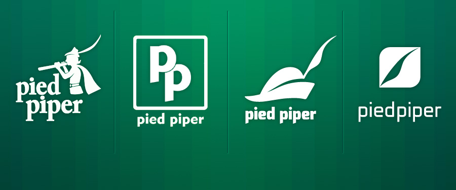
Pied Piper 1.0 and 1.5
Pied Piper’s growing pains are immediately apparent, with an entire episode dedicated to spoofing many tech startup chestnuts, including:
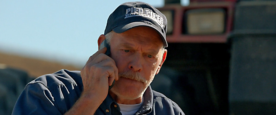
- Their legal incorporation, and cutting a deal with the irate owner of an irrigation company.
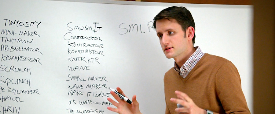
Trademark lawsuits happen all the time, and name rights to some of the most influential products in history have had to fight for it in court. - A brainstorm session for a new name only produces incomprehensible “compressed” words (does “SMLR” = “smaller”… or “smiler”?)
This parodies tech businesses’ odd fixation on goofy names or dropped vowels. Twitter could have launched as “Twitch”, “twttr” and “smssy”. - Company co-invester Erlich Bachman takes matters in his own hands by going on a drug-induced “vision quest”. It’s a fruitless endeavor resulting in a frivolous observation: “Technolo-jesus…? It’s all just meaningless words!”
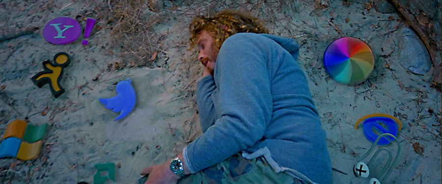
Silicon Valley’s infamous hippie drug culture is ripe for parody – and a real-life tech mogul did in fact suggest that an acid trip was “like being in the presence of Jesus”.
![]() As far as the actual logo: the “first official purchase of Pied Piper” was a crappy t-shirt with generic clip art. Erlich later recruits a graffiti artist to paint a new logo on their garage door, only asking for something original. This shortsighted grant of artistic license naturally backfires, and is never seen or used again.
As far as the actual logo: the “first official purchase of Pied Piper” was a crappy t-shirt with generic clip art. Erlich later recruits a graffiti artist to paint a new logo on their garage door, only asking for something original. This shortsighted grant of artistic license naturally backfires, and is never seen or used again.
Both of these rudderless branding attempts are peppered with vulgar humor (this is an R-rated comedy, after all), but that’s beside the point. A bunch of guys in a room with a groundbreaking product and no vision evokes Apple’s original logo: an exceedingly ornate illustration without practicable brand value.
Pied Piper 2.0
 After a visit from law enforcement, Erlich talks the graffiti artist into a revision that “you white boys might like”. Which turns out to be generic and uninspired.
Tech companies have a curious tendency of lowercase lettered logotypes. As the story goes, the punchline is the “white boys'” failure to visually define themselves, and default to a “safe” – albeit vanilla brand.
Pied Piper 3.0
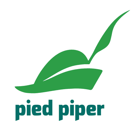 Hired-gun CEO “Action” Jack Barker had this version created without consent of the founders. 3.0’s clean, simplified “feather and hat” icon and typeface is a significant step forward as a brand and Pied Piper’s maturation to a legitimate company. Yet, it is derivative of their direct competitor Hooli’s brand: a predictable outcome for an unimaginative executive in the vein of a Steve Ballmer. And, as the limit of Jack Barker’s “action” amounted to aping a competitor, he predictably went to work for them.
Pied Piper 4.0
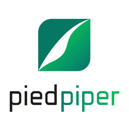 With only one season left, 4.0 (introduced in season five) is presumably the final version. As a story arc, it’s the file compression company’s brand distilled to its purest form. Light and clean with simple letterforms, it reduces the artifice of the “pied piper” metaphor down to a simplified feather graphic, subtly showing the company’s completion of its arc: successfully having gone to market with a peerless product, and no longer bound by fickle investors or indifferent senior executives.
On a final note, I would point out the visual narrative of each logo’s introduction. When it appears on screen and protagonist Richard Hendricks is facing forward he’s in charge, literally standing behind his product. When a new logo is introduced and his back is to the camera, he’s a passive witness to an out of control calamity.
As of this writing, Silicon Valley still has seven unaired episodes left in the series, so it remains to be seen if Pied Piper will succeed.
All Silicon Valley and Pied Piper images are ©Home Box Office.