On Thursday, June 27th 2019, Apple announced their Chief Design Officer’s exit, after nearly three decades with the company. My thoughts on this significant turn includes Ive’s top five Apple product designs.
A Fresh Start With An Uncertain Future
Around the time I bought my first Mac for school and freelance, Apple was in horrible shape and Jony Ive was ready to quit. Fortunately he was talked into having faith in their future: the next two decades were an incredible march of groundbreaking product design and invention.
At the center of Apple’s resurgence was Steve Jobs’ prescient marketing instincts and Jony Ive’s genius for finding humanity in complicated technology. Their spiritual partnership – not unlike Paul McCartney and John Lennon’s – led to the surprise and delight of customers with thoughtfully designed products, and their meteoric rise from near bankruptcy to the most valuable tech company in the world.
“Design is a really loaded word… most people think it’s how [something] looks, but it’s not really; it’s how it works.” — Steve Jobs
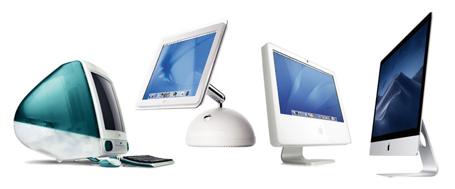
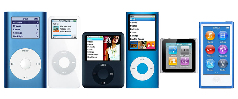
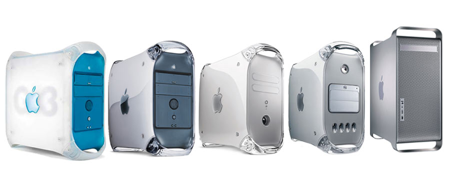
Kids who grew up with The Beatles in the 60’s saw them mature from pop radio fare to crafting more sophisticated arrangements. In that same sense, Apple products have evolved over time with original designs, functionality and manufacturing processes.
Apple’s Current And Future Developments
On announcing Ive’s departure, Apple emphasized that not only was he leaving a solid design team in place, he would continue to be involved in future projects.
While many doomsayers foresee catastrophe, the era of rapid product redesigns has long passed. I really don’t think it’s that big of a deal. Creative reinvention doesn’t make sense for their mature product lines. The Jobs-Ive “Beatles era” may be over, but Ive will still be around, obsessing over hidden details and getting his design out of the way.
“A lot of what we do is getting design out of the way. When forms develop with that sort of reason and not just arbitrary shapes, it feels inevitable… almost undesigned.” — Jony Ive
Top Five By Jony Ive
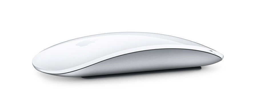
1. Magic Mouse
The Magic Mouse has a single, elegantly curved enclosure that belies its functional complexity. I think it’s one of the most beautiful Apple products ever made, and if there was any single design that Wall-E’s EVE might have taken a cue from, this would be it.
2. Power Mac G4 Cube
Introduced in July, 2000, the G4 Cube was a one-of-a-kind geometric enclosure. Although a failure in the market, I knew several designers who would have given their eye teeth for one of these. Apple took lessons learned from this product design and incorporated them into the Mac Mini five years later, which continues to sell to this day.

3. iPhone 5
This phone is straight out of the Dieter Rams school of design, and in my opinion iPhone’s high watermark as an intersection of aesthetic and function. Although it remains to be seen if a future iPhone will ever return to similar form, Apple did repurpose this design with the latest iPad Pro.

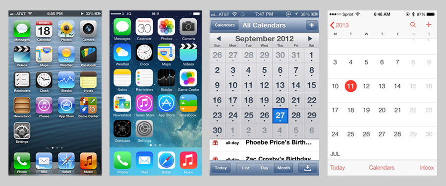
4. iOS 7 and macOS Yosemite
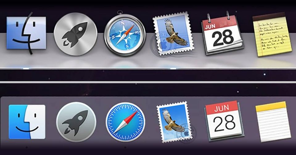
In 2000, Steve Jobs famously described OS X’s new interface as “looking so good, you’ll want to lick it“… “skeuomorphic” elements gradually creeped into later releases for both iOS and OS X. When Ive was given authority over iOS’ UI, he eliminated visual noise with a cleaner, unobtrusive interface, and this redesign made its way to OS X the following year with the release of Yosemite. For anyone who’d have rather gouged out their eyes than look at OS X’s former hideously leather-stitched calendar app, say “thank you, Jony Ive”.
5. Unibody MacBook Pro
Manufactured with a single metal enclosure rather than multiple welded parts, the Unibody MacBook Pro was a tour de force of industrial design that led to thinner, more durable products made of highly recyclable material. A breakthrough so important, Ive gave a rare live presentation.
In his own words:

